Notes
Everything in the notebook, newest first. Each note takes one typography or layout decision and works it through, with the CSS.
4 notes. New ones arrive when they are ready, not on a schedule.

Building a type scale you'll actually use
A modular scale is a good start and a bad finish. How I pick a base and a ratio, how many steps to keep, and how to make the result fluid without losing control of it.
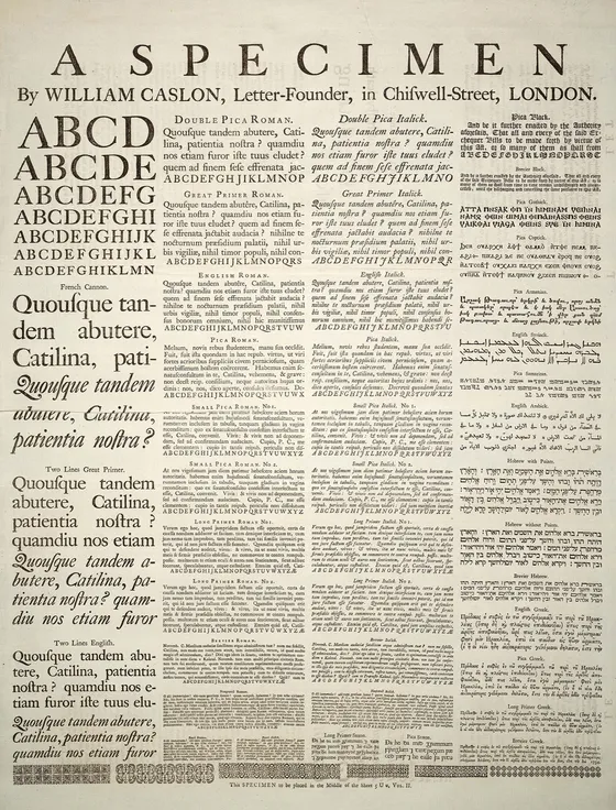
Line length, leading and the reading column
Measure, line height and size depend on each other. How I set a reading column in CSS, why 65ch is not 65 characters, and what changes on a phone.
Contrast that passes and still looks good
WCAG contrast ratios are a floor, not a style. What the numbers measure, where designs usually fail them, and how to build a palette that clears them without looking harsh.
Spacing tokens: fewer values, better layouts
A short spacing scale does more for a layout than any grid. How I choose the values, name them, apply them with gap, and clean up a codebase full of one-off margins.