Building a type scale you'll actually use
A modular scale is a good start and a bad finish. How I pick a base and a ratio, how many steps to keep, and how to make the result fluid without losing control of it.
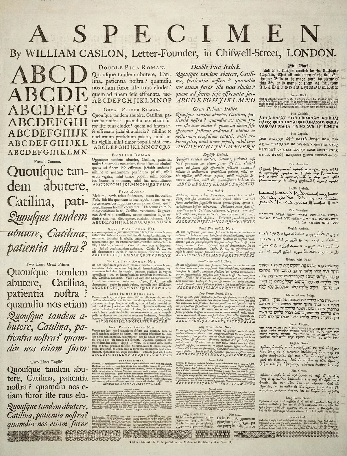
Most type scales I inherit have too many sizes. There is a 13, a 14 and a 15 for small text, a 28 and a 30 for headings that nobody can tell apart, and a 17.5 that appeared during a deadline. Each was a reasonable decision on the day. Together they make a page that never quite settles, because the eye keeps noticing differences that mean nothing.
A scale fixes that by deciding the sizes once, before any page needs them. Here is how I build one now.
Start from the text, not the headline
The body size is the one decision everything else hangs on, so make it first and make it on real text. Set three or four paragraphs of something you would actually publish in your chosen face, at 16, 17, 18 and 20px, and read them on a phone and on a laptop at arm’s length.
Typefaces differ a lot at the same nominal size. A face with a large x-height, like most humanist sans serifs, reads comfortably at 16px. A book serif with a small x-height may need 18 or 19 to feel the same. The pixel number is only a label for the em box; what your reader sees is the lowercase.
For long reading on screens I usually end up between 17 and 20px. Less for interfaces, where people scan more than they read.
Pick a ratio that suits the content
A modular scale multiplies the base by a fixed ratio to get each step up, and divides by it to get each step down. With a base of 18px and a ratio of 1.25:
/* 18 × 1.25ⁿ, rounded to a tenth of a pixel */
--step--1: 14.4px;
--step-0:  18px;
--step-1:  22.5px;
--step-2:  28.1px;
--step-3:  35.2px;
--step-4:  43.9px;
--step-5:  54.9px;
The ratio sets the character of the page. Small ratios, 1.125 or 1.2, give quiet steps that suit documentation, dashboards and anything with deep heading levels. Larger ones, 1.333 or 1.5, give dramatic jumps that suit editorial pages with one big headline and very little hierarchy below it.
There is no correct ratio. A useful test is to count how many heading levels you really need. If articles go down to h4, a big ratio will push h1 to an absurd size by the time the small steps are distinct. If you only ever use h1 and h2, a small ratio will leave them looking almost the same.
Keep fewer steps than the maths gives you
The scale continues forever in both directions. You need perhaps six values: one small size for captions and metadata, the body, two or three heading sizes, and one display size. Name them and stop.
I name steps by position (--step-0, --step-1) rather than by role (--size-h2). Position names survive redesigns. When the card title needs to be a little smaller, you change which step it uses instead of inventing --size-h2-small.
Round, then check the pairs
Ratios produce awkward numbers. Rounding to whole pixels, or to a tenth, is fine and nobody will notice. What people do notice is two adjacent steps that look the same, which happens at the bottom of a small ratio. At 1.125, 16 and 18px sit next to each other, and in many faces that difference vanishes once weight or colour changes too.
So after rounding, look at each neighbouring pair on the page: body against small, h3 against h2. If you cannot tell them apart at a glance, drop one.
Let it breathe across widths
A ratio that looks right on a 1440px screen is usually too steep for a phone, because the top steps run out of room. The common answer is two ratios: a smaller one at the narrowest width, a larger one at the widest, and clamp() interpolating between them.
:root {
  /* 18px → 20px body; 36px → 55px display, between 360px and 1440px */
  --step-0: clamp(1.125rem, 1.08rem + 0.19vw, 1.25rem);
  --step-5: clamp(2.25rem, 1.85rem + 1.76vw, 3.44rem);
}
Two cautions. Keep a rem term in every clamp(), so the size still responds when someone raises their browser’s default font size; a pure vw value ignores it and can fail WCAG’s resize-text criterion. And do the arithmetic once in a small script or a calculator, then paste the results. Hand-tuned vw values drift apart within a week.
Line height belongs to the step
Leading should shrink as size grows. Body text wants around 1.5. A 48px headline set at 1.5 looks like three separate lines that happen to be near each other; it wants something closer to 1.1. I store a line height next to each step so nobody has to remember:
h1 { font-size: var(--step-5); line-height: 1.05; }
h2 { font-size: var(--step-3); line-height: 1.15; }
p  { font-size: var(--step-0); line-height: 1.55; }
Try it before you commit
The playground below sets h1 to small text from any base and ratio, with pixel and rem values. Drag the ratio until the heading steps feel distinct and the small text still reads as part of the same family, then copy the custom properties. Then set a real article in it before you decide.